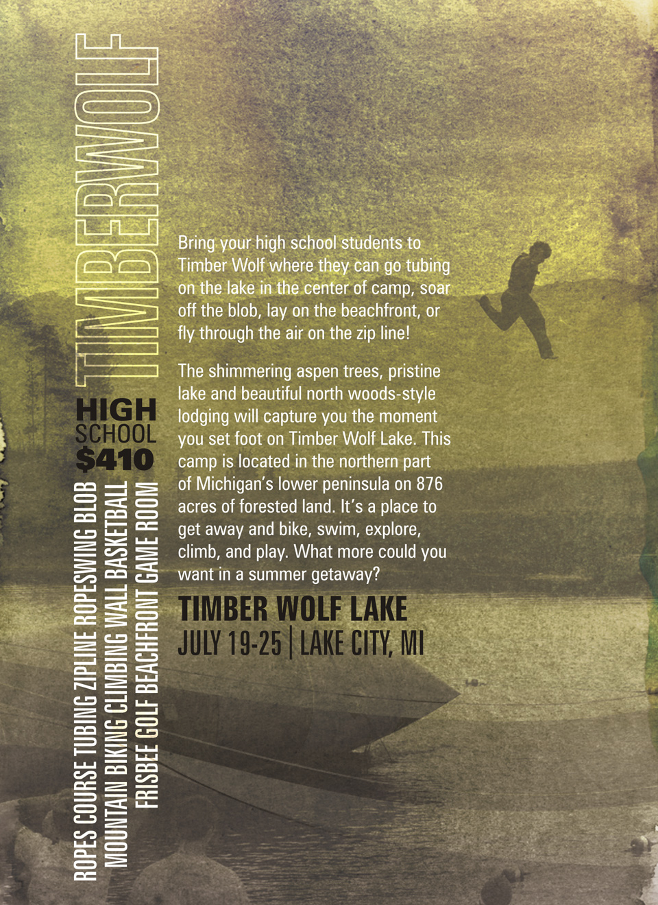
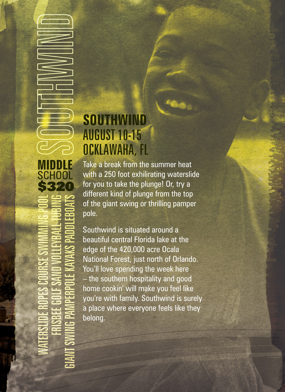
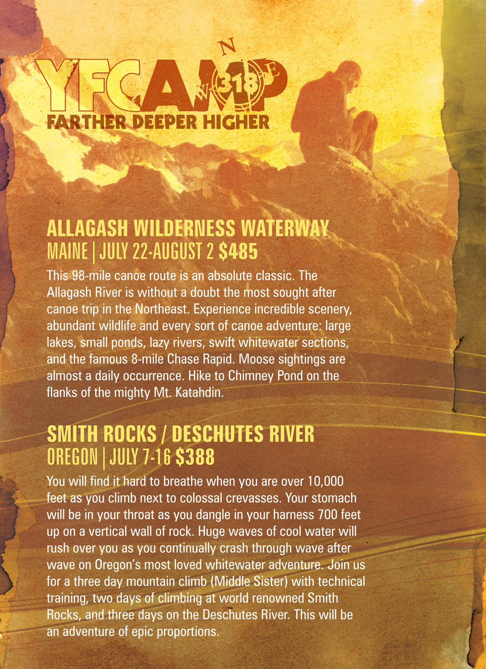
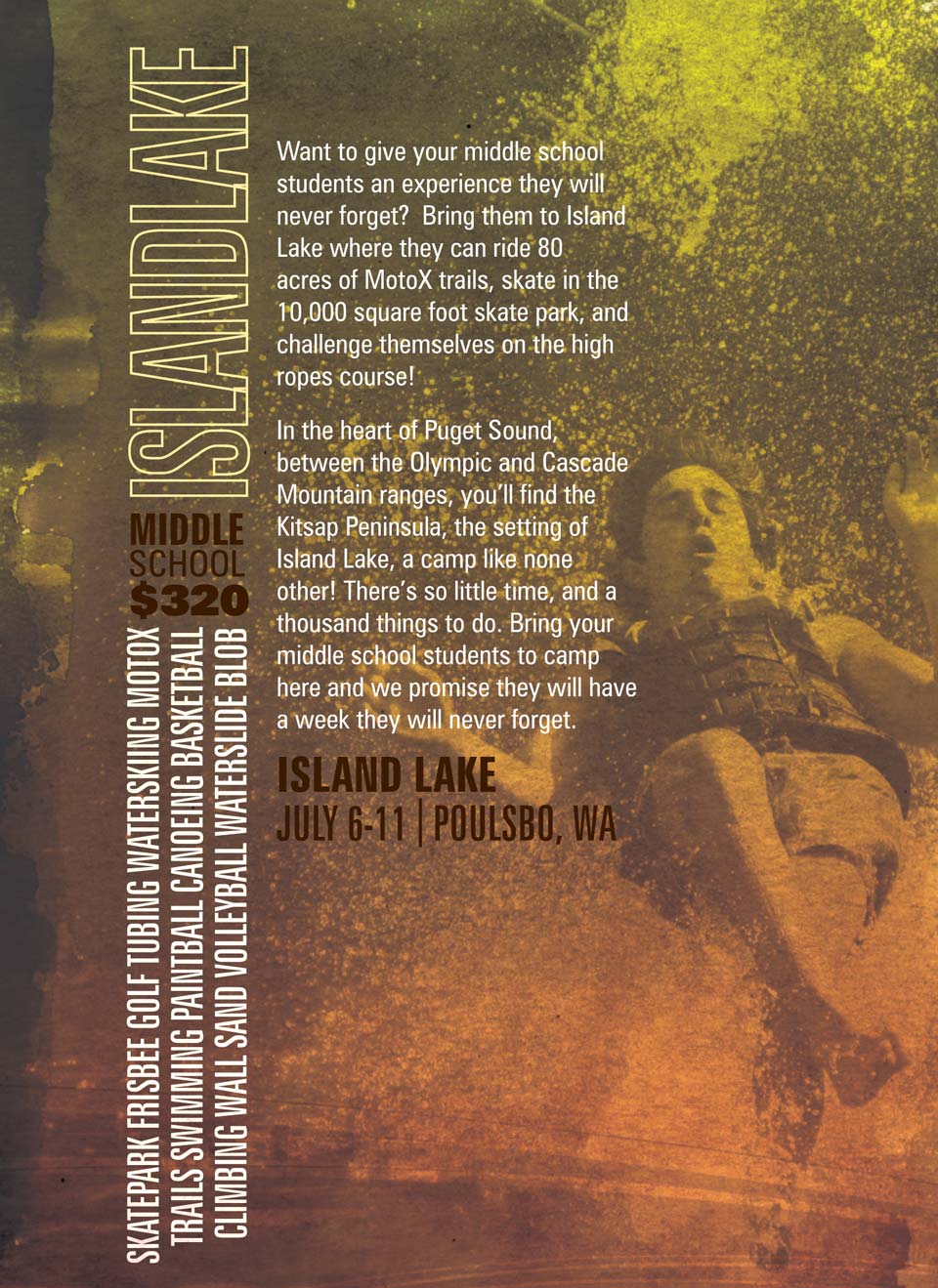
For this fourth rendition of YFCAMP’s annual mailing, I employed a watercolor palette, each of the brochure’s six panels delineated by streaks of paint, allowing wiggle room for the printer’s scores and folds. Along with the flowing lines that stretches the full length, this approach successfully ensured that the piece cohered throughout. Each year I’ve asked YFCAMP if they want to start from scratch, but they are in love with the autumnal palette, and the challenge has been to create something fresh but consistent each season. You can also view 2007 and 2008 to see if I’ve succeeded.


